


The Gantt Chart as “eye candy”
Posted by lward on Nov 18, 2021 in PMChat Bloggers, Uncategorized | Comments Off

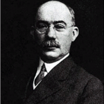 Henry Gantt. He gave us one of the greatest communications tools of all time. He also gave some the easy way out! Henry Gantt is a giant in our field. He developed a format for a report that can take the most complicated set of interdependent tasks and graphically depict them in such a way that even executives can understand what’s going on! And even though it’s not a precedence diagram, a Gantt chart, easily created by the touch of a button using high-powered software, can show a certain level of dependencies between and among activities. Needless to say, when used appropriately, it is an effective tool for project communications that few reports of its kind can match. But where a Gantt chart become mere “eye candy” (defined as visual images that are superficially attractive and entertaining but intellectually undemanding ) is when there is literally nothing behind what you see on the report itself. For example, any one with a limited knowledge of, let’s say, Microsoft Project, and even less knowledge of project management, can develop a list of activities, assign some start and end dates,hit a button, and create a beautiful Gantt chart (in color no less)
See more here:
The Gantt Chart as “eye candy”
#PMChat on Twitter
-
 Ralf Finchett: War on Project Failure http://t.co/yjrbpn4jNi #pmot #pmo #project #pmchat #pmi
 -
Ralf Finchett: Project and Programme Manangement Jargon! http://t.co/1Dkf0korWM #pmot #pmo #project #pmchat #pmi
-
Ralf Finchett: Project Management Around the World - (London, England, UK, Europe) http://t.co/cMqpIm6Bx1 #pmot #pmo #project #pmchat #pmi